The consumer app is shedding its old job. For two decades the app was a destination, a place users went to browse, linger and choose. Across three recent stories on this beat, the destination is dissolving: Facebook is experimenting with eliminating the home screen in one market, Google is asking users to distinguish between two apps that look nearly identical, and a subscription is being assembled that treats several products as interchangeable doors into one bill. The pattern is that apps are increasingly being positioned less as places and more as funnels, and in each case the funnel narrows toward something the company can charge for or measure.
A Market Where the Home Screen Disappears
Meta is testing a Facebook experience in India that sends some users directly into full-screen video when they open the app, according to TechCrunch, putting Reels front and center. That is not a redesign in the ordinary sense. It is the removal of the feed's central function as a decision point. A user who opens the app and lands immediately in a vertical video has not chosen what to watch; the app has chosen for them, and the only remaining interaction is to keep watching or leave.
The choice of India as the test market is the detail that matters for anyone watching the US market. Meta has a long history of testing interface changes in large, mobile-first markets before deciding whether they travel. If the full-screen opening works there, the logic that makes it work does not depend on geography. It depends on the fact that video holds attention, and attention is what Facebook sells. American users should read this as a proposal rather than a foreign experiment.
Two Google Apps and One Uncomfortable Question
Engadget's comparison of Google Photos and the Gallery app poses a question that should be simple and is not: which of these should a person use? Both are Google products. Both show pictures. The existence of an explainer at all is the story. When a platform ships two applications that overlap enough to require arbitration, the user is being asked to do work the company has not finished.
This is the funnel pattern in a quieter form. Google Photos is the surface with the storage relationship, the account tie-in and the machine learning features. The Gallery app is the surface a device ships with. Asking which one to use is really asking which layer of the stack the user is supposed to live in, and the answer changes depending on how much of Google's ecosystem that user has accepted. For American consumers, the practical cost is a recurring moment of doubt at the exact point where photos are most precious and least replaceable. Duplication is not a feature. It is a fork in the road that the company left standing.
One Bill, Several Products
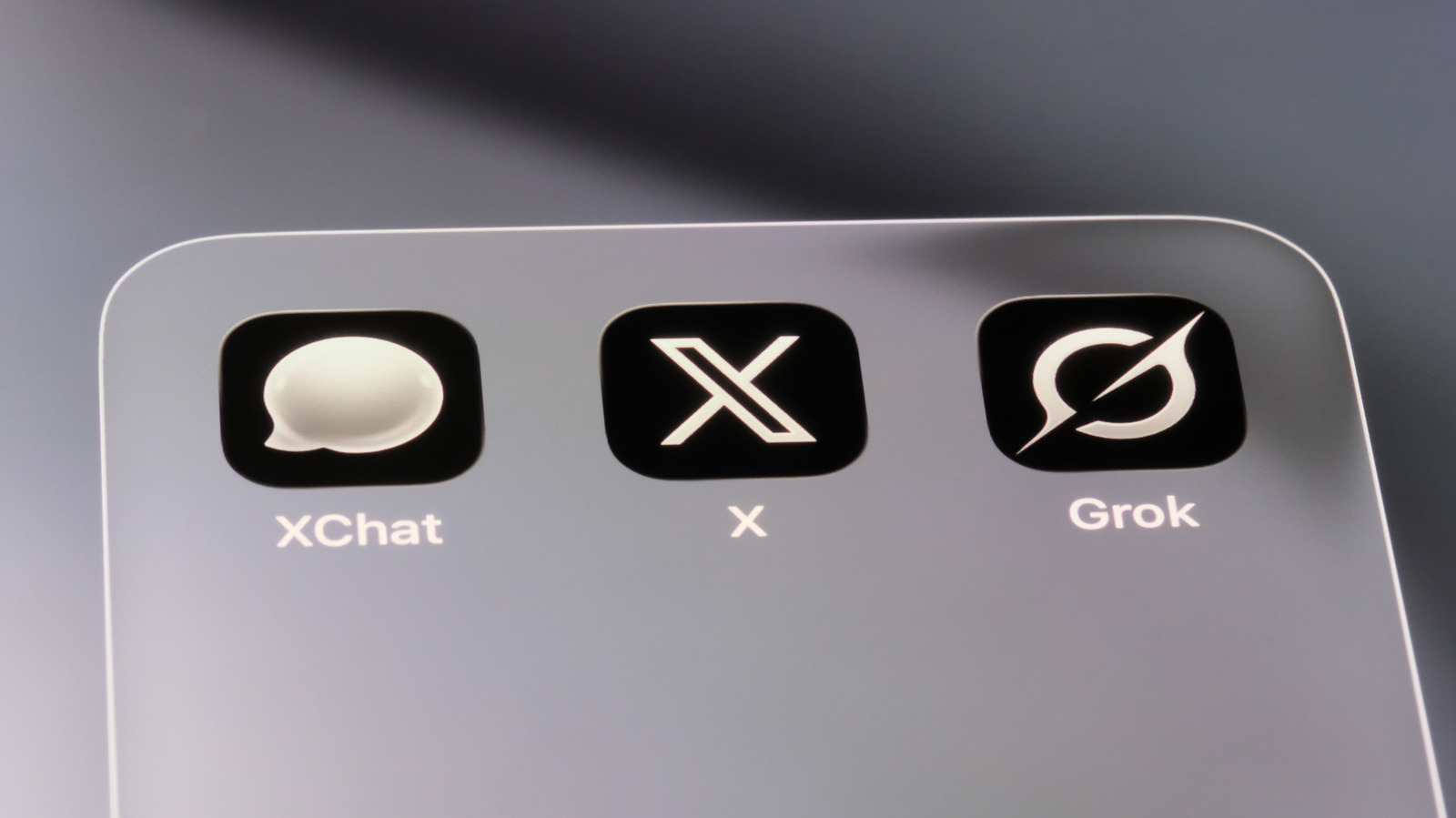
SpaceXSI's new subscription scheme bundles access to Grok, Grok Bot, Cursor and X Premium into a single monthly plan, as Engadget reported. This is the funnel pattern applied to billing. Each of those products could be sold separately, and presumably some are. Bundling them means the company is no longer asking users to evaluate an individual tool on its merits. It is asking them to evaluate a relationship.
Bundles work when the constituent parts are complementary and fail when they are merely adjacent. What SpaceXSI is testing is whether adjacency is enough. The strategic appeal is obvious: a single subscription raises switching costs, complicates comparison shopping and gives the company one number to report instead of several. The risk is equally obvious. A user who wanted one product and is now paying for four may eventually notice, and the bundle becomes a reason to leave rather than a reason to stay.