The latest app stories share a single thread: users are no longer just downloading software, they are reclaiming control over it. Whether the goal is escaping doomscrolling, restoring a missing home-screen button, or getting simpler navigation, the pressure is on app makers to give people a way back to the experience they actually want. For U.S. technology companies and the consumers they serve, that changes what a successful app looks like.
The user as editor
For years the dominant story in apps and services was accretion. Every release added features, every home screen filled with more icons, and every feed got better at holding attention. The stories logged on this beat recently suggest the pendulum has swung. TechCrunch reported on apps designed to distract users from the endless cycle of doomscrolling, framing them as a way to spend more time on content that is engaging and productive. That is a notable reframing. The remedy for too much app time is not less app time but a different set of apps, chosen deliberately.
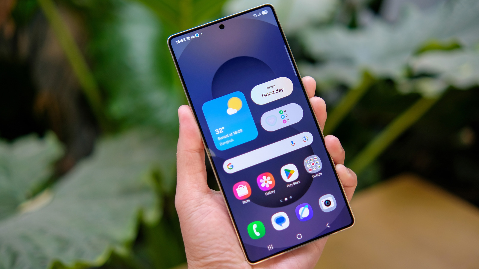
Engadget captured the same instinct at a smaller scale. Samsung's One UI removed the all apps button, and Engadget noted that it is a single toggle away from coming back. The detail matters less than the assumption behind the coverage: that users should be able to restore a familiar control they lost. A settings toggle is a small thing, but it is also an admission that defaults are not final and that the person holding the phone gets a say.
Simplicity as a feature, not a fallback
The third story pushes in the same direction from a different angle. Engadget reported that one GPS navigation app should be the go-to for older drivers, because it offers simple turn-by-turn directions that help them feel more confident about driving somewhere new. This is not a story about cutting-edge mapping technology. It is a story about an app winning by removing friction for a group that other products often overlook.
Read together, the three stories describe a market where clarity beats cleverness. The doomscrolling alternatives win by making productive content easier to reach. The navigation app wins by making a stressful task feel manageable. The Samsung toggle wins by letting a user undo a change they did not ask for. In each case the value is in what the app takes away, not what it piles on.
Why this matters to U.S. companies
For U.S. app makers and platform owners, the strategic implication is that control is now part of the product. A feature that cannot be turned off, a layout that cannot be reverted, or a feed that cannot be escaped becomes a liability rather than a lock-in. The Samsung example is especially instructive because it comes from a device maker with a large U.S. installed base. When a vendor removes a familiar element, the press and the user base now treat restoration as an expected, routine fix rather than a concession. Companies that build in those reversals from the start spend less time managing backlash.